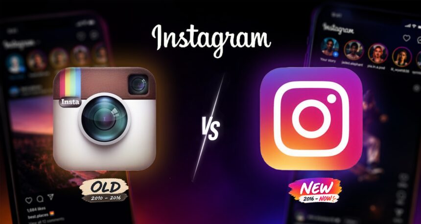
Instagram has quietly given its famous app icon a visual makeover, introducing a brighter and more vivid version of its familiar gradient logo as the social-media platform refreshes its identity for a new generation of users. The change does not abandon Instagram’s instantly recognisable camera-shaped symbol. Instead, the company has intensified the colours of the existing gradient, producing a more luminous combination of pink, purple, orange and yellow.
The redesigned icon began appearing for users through an app update, making it one of Instagram’s most noticeable visual changes in years. The refresh comes almost exactly a decade after Instagram introduced the gradient logo that transformed its visual identity in 2016. That redesign replaced the original retro-style brown camera icon and became one of the most recognisable symbols of the modern social-media era.
What Changed in Instagram’s Logo?

At first glance, the makeover may be easy to miss. Instagram has retained the basic rounded-square shape, white camera outline and multicoloured gradient that users already associate with the platform. The difference lies primarily in the colour treatment. The new version appears brighter and more saturated, with stronger pink, purple and orange tones. The gradient also feels more energetic and luminous than the previous version. That subtle approach is deliberate.
For a platform used by billions of people, completely replacing a globally recognised icon would carry considerable branding risk. Instagram can modernise its appearance while ensuring users can still immediately identify the app on their phones. The update is therefore better understood as an evolution rather than a complete redesign. Instagram has also been refining other elements of its visual identity, including typography, layouts and design systems used across the app and its marketing materials. Together, these changes aim to create a more flexible identity that works across smartphones, videos, advertisements and emerging digital formats.

From Polaroid Camera to Global Symbol
Instagram’s logo has changed dramatically since the platform launched in October 2010. The earliest icon was heavily inspired by an instant camera. It featured a detailed brown camera body, lens and rainbow stripe, a design that matched Instagram’s original identity as an app focused primarily on square photographs and vintage filters. A more polished version of that camera remained associated with Instagram during its explosive early growth.
Then came the major transformation. In May 2016, Instagram abandoned the realistic camera illustration and introduced its now-famous minimalist white camera outline over a pink, purple and orange gradient. The change initially generated considerable criticism. Some users considered the new icon overly simple and preferred the nostalgic appearance of the old camera. But the redesign eventually became inseparable from Instagram itself. Ten years later, the gradient icon represents a platform that has changed far beyond its original photo-sharing purpose.

Why Instagram Is Updating Its Look
Instagram today competes in a dramatically different social-media environment. The platform is no longer primarily about posting filtered photographs. Reels, Stories, direct messaging, creators, influencers, shopping and video now occupy enormous parts of the Instagram experience. Instagram also faces fierce competition for younger audiences from TikTok, YouTube, Snapchat and other platforms.
A brighter logo may seem like a minor adjustment, but visual identity is extremely important for technology companies. App icons compete for attention on crowded smartphone screens, while logos must remain recognizable across everything from tiny notification symbols to giant advertising displays.
Instagram’s makeover therefore reflects the challenge of keeping an established brand feeling contemporary without destroying the recognition accumulated over more than 15 years. Parent company Meta has similarly worked to create clearer visual identities across Instagram, Facebook, WhatsApp, Messenger and Threads while keeping each platform distinct.
Instagram Has Changed More Than Its Logo
The makeover also arrives as Instagram itself continues evolving. Short-form video has become central to the platform as Instagram competes directly with TikTok. Reels now play a major role in content discovery, while creators increasingly use Instagram as a professional platform for building audiences and businesses. Artificial intelligence is also becoming more important in deciding what users see. Rather than simply displaying posts from accounts someone follows in chronological order, Instagram increasingly relies on recommendation systems to surface Reels, posts and creators based on predicted interests.
That evolution has occasionally generated criticism from users who argue that Instagram has moved too far away from its original focus on photographs and personal connections. The logo therefore provides an interesting visual metaphor for Instagram itself: the basic identity remains familiar, but almost everything underneath it has changed.
Does a Logo Makeover Really Matter?
A slightly brighter gradient will obviously not determine Instagram’s future. The platform’s larger challenges involve competition, artificial intelligence, privacy, online safety, advertising and maintaining relevance among younger users. Critics could therefore dismiss the redesign as cosmetic. But major technology companies treat even tiny visual changes seriously because their logos are seen billions of times. Instagram’s icon sits on smartphone screens around the world and appears across websites, advertisements, videos and businesses.
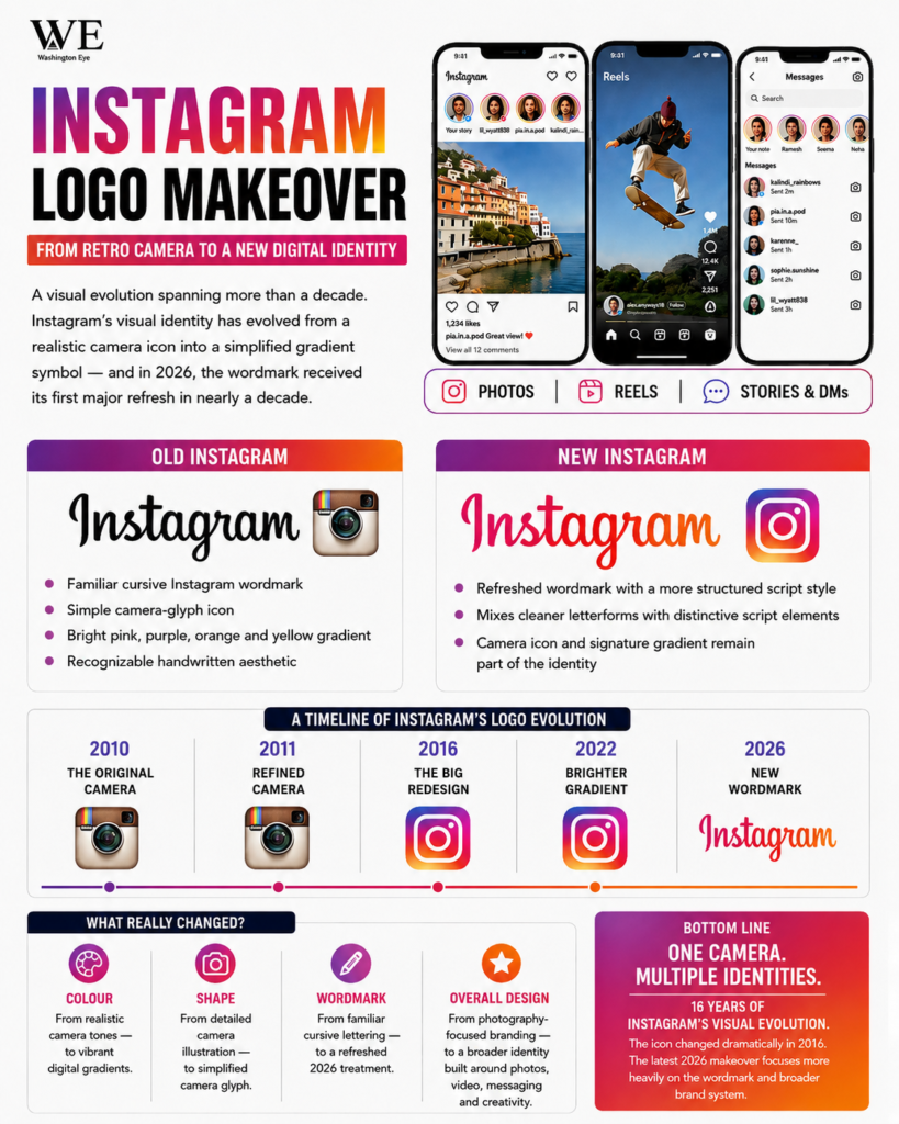
Changing it too dramatically could weaken recognition. Never changing it could make the brand appear dated. Instagram has chosen the safer middle ground: keep the camera, keep the gradient, but make everything brighter. It is considerably less revolutionary than the controversial redesign of 2016. And that may be exactly the point. After more than 15 years of Instagram, and a decade with its famous gradient, the platform no longer needs a completely new identity. It simply wants its old one to look a little more alive.