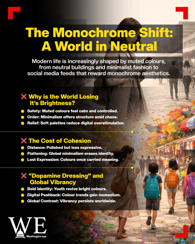
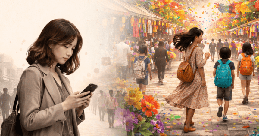
Scroll through social media, walk into a modern café, or look at today’s wardrobes, and one thing stands out: life appears quieter in colour. From beige interiors and grey streetscapes to black-white wardrobes and muted digital aesthetics, a growing number of people are asking a deceptively simple question, has life lost its colours?
The shift is not tied to a single place or moment. Over the past decade, particularly after the COVID-19 pandemic, a global preference for monochrome, neutral and “aesthetic” palettes has taken hold. Fashion runways, smartphone interfaces, architecture, branding and even social media filters have leaned heavily toward greys, creams, blacks and off-whites. Where bright reds, blues and yellows once dominated daily life, subdued tones now signal taste, calm and modernity.
Observers say the change reflects more than just a design trend. Psychologists and cultural commentators argue that colour choices often mirror social mood. In uncertain times, marked by economic pressure, climate anxiety, political polarisation, and digital fatigue, people may gravitate toward colours that feel controlled, safe, and emotionally contained. Minimalism, once a niche lifestyle choice, has become mainstream, offering visual order in an increasingly chaotic world.
Yet for many, the transition feels like a loss. Older generations recall streets filled with colourful signboards, vividly painted homes, patterned fabrics and playful fashion. Childhood memories are often tied to bright school bags, festival decorations, bold cartoons and loud colour contrasts. “Colours felt alive,” says one Berlin-based designer. “Now everything is elegant, but emotionally distant.”
Social media has amplified this perception. Platforms reward uniformity: beige feeds, monochrome outfits and carefully curated neutral backgrounds often perform better than visually loud content. Algorithms favour what is soothing and consistent, pushing users, especially younger ones, toward a narrow aesthetic range. What began as a visual trend has quietly shaped collective taste.
The past, however, was not simply more colourful, it was less filtered. Colours existed without the pressure of branding or mood boards. Homes reflected personality rather than palette rules. Clothes were chosen for expression, not cohesion. In many cultures, bright colours also carried social meaning: celebration, resistance, joy, identity. Their fading visibility raises concerns about cultural flattening in a globalised digital world.
At the same time, defenders of monochrome argue that dull does not mean empty. Neutral tones can be calming, inclusive and timeless. In architecture and design, muted colours allow space, light and form to take centre stage. For individuals dealing with overstimulation, softer palettes offer mental relief. “It’s not that colour has disappeared,” says a cultural theorist, “it has become selective.”
Still, nostalgia persists. Bright colours now evoke memory, childhood summers, festivals, handwritten posters, hand-painted buses, and crowded markets. They represent a time perceived as emotionally fuller, even if imperfect. The longing for colour, critics say, is really a longing for connection, spontaneity and visible joy.
Interestingly, signs of resistance are emerging. Independent fashion labels, youth movements and cultural festivals are slowly reintroducing bold colours as statements of identity and rebellion. In parts of Asia, Africa and Latin America, vibrant palettes remain central, challenging the dominance of Western minimalism. Even on social media, hashtags celebrating “colour therapy” and “dopamine dressing” suggest a quiet pushback.

So, has life truly lost its colours? Or have colours simply changed meaning? The answer may lie somewhere in between. Life today is polished, coordinated, and visually calm, but also emotionally cautious. Bright colours have not vanished; they have become rare, symbolic, and deeply nostalgic. As one online comment put it: “Monochrome is pretty, but colours felt alive.”


