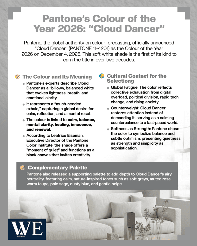
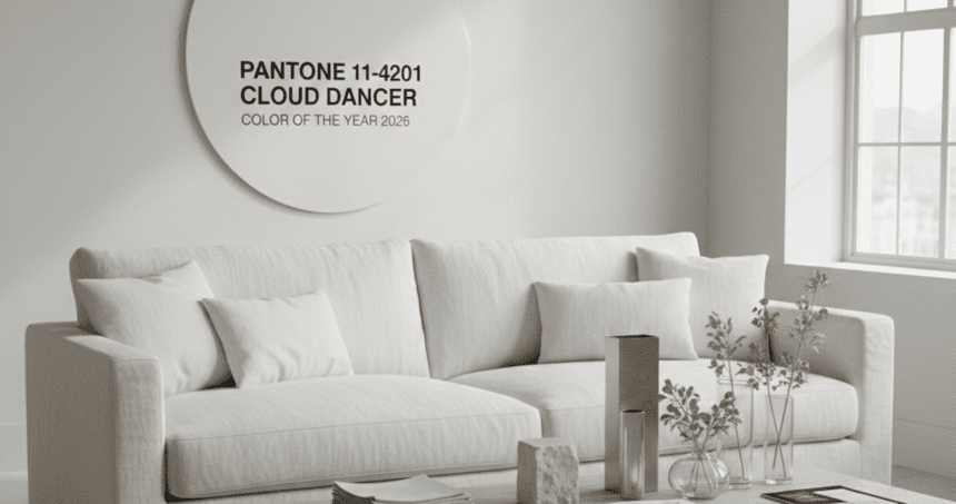
Pantone, the global authority on colour forecasting and design direction, officially announced on December 4, 2025, that “Cloud Dancer” (PANTONE 11-4201) will be the Colour of the Year 2026, making it the first soft white shade to earn the annual title in more than two decades. The announcement, made through Pantone’s website, global press release, and a livestreamed reveal, signals a decisive shift toward minimalism, serenity, and visual clarity at a time when the world is increasingly saturated by noise, complexity, and digital overstimulation. Described by Pantone’s experts as a “billowy, balanced white that evokes lightness, breath, and emotional clarity,” Cloud Dancer represents what the company calls a “much-needed exhale,” capturing a global desire for calm, reflection, and mental reset.
According to Leatrice Eiseman, Executive Director of the Pantone Color Institute, the selection of Cloud Dancer emerged after an extensive year-long study of cultural trends, social behaviours, fashion movements, environmental influences, and the psychological impact of colour in turbulent times. Eiseman explained that after years marked by geopolitical tensions, rapid technological acceleration, and rising anxiety levels, the world is collectively yearning for visual comfort and simplicity. “Cloud Dancer offers us a moment of quiet,” she said. “It is a colour that feels open, soft, and forgiving, a gentle space to breathe and realign,” Eiseman added that the shade represents emotional renewal rather than emptiness, functioning as a blank canvas that invites creativity rather than overwhelm.
Pantone’s Vice President, Laurie Pressman, echoed this perspective, noting that the organisation wanted a colour that symbolised balance and subtle optimism without the intensity of past years’ bold and dramatic selections. Unlike the deep moody “Future Dusk” chosen for 2025 or the vivid hues of earlier years, Cloud Dancer takes a different direction: it embraces quietness as a form of strength and simplicity as a form of sophistication. Pressman described it as “a structural colour, one that supports, uplifts, and illuminates without overpowering,” making it ideal for designers seeking both elegance and emotional resonance.
Design experts around the world reacted swiftly to the announcement, praising Cloud Dancer for its versatility, timelessness, and universal appeal. Fashion designers noted that soft whites have dominated recent runway cycles, appearing in both summer and winter collections for their ability to evoke purity, airiness, and understated luxury. Interior designers highlighted that the colour aligns perfectly with ongoing global trends favouring clean lines, warm minimalism, and serene living spaces. With consumers increasingly investing in calming home environments, Pantone’s selection reinforces the cultural momentum toward neutral, comforting aesthetics. Beauty brands also welcomed the decision, foreseeing new product packaging, soft-focus campaigns, and skincare-inspired visuals built around whites, creams, and gentle tones.
Pantone released a complementary palette alongside Cloud Dancer, featuring soft greys, muted rose, warm taupe, pale sage, dusty blue, and gentle beige, all intended to reflect calm atmospheres and natural textures. The palette aims to help designers balance Cloud Dancer’s airy neutrality with understated depth, allowing the colour to work in both minimalist compositions and layered, textured spaces. According to Pantone, Cloud Dancer excels when paired with tactile materials like linen, raw wood, light stone, and brushed metals, which collectively reinforce the sense of softness and grounding.
Cultural analysts interpret Pantone’s choice as a response to global fatigue. After years defined by constant notifications, digital clutter, hyper-stimulating visuals, political polarization, and environmental alarms, Cloud Dancer stands out precisely because it does not demand attention, it restores it. It is a colour linked to beginnings: the blank page before writing starts, the open sky before sunrise, the moment of stillness before movement. Its psychological associations include calm, balance, mental clarity, healing, innocence, and renewal, making it a powerful emotional counterweight to the world’s accelerating pace.
Tech companies have already shown interest in incorporating Cloud Dancer into user-interface design, citing growing demand for “visual quiet zones” within apps and devices. Marketing agencies predict a rise in minimalist advertising campaigns, wellness-themed branding, and soft-toned digital aesthetics throughout 2026. Meanwhile, sustainability advocates praised Pantone’s subtle nod to nature, noting that whites, like clouds, fog, sand, and stone, symbolise the natural world’s calming, enduring elements.

As industries begin preparing their 2026 collections, Cloud Dancer is expected to influence everything from fashion lines and product packaging to home décor, beauty trends, brand identities, and digital design. Ultimately, Pantone’s Colour of the Year is not simply about trends; it is a cultural mirror. And in 2026, Pantone believes the world needs clarity, softness, and breathing room. Cloud Dancer offers exactly that: a gentle invitation to pause, reset, and start anew.


